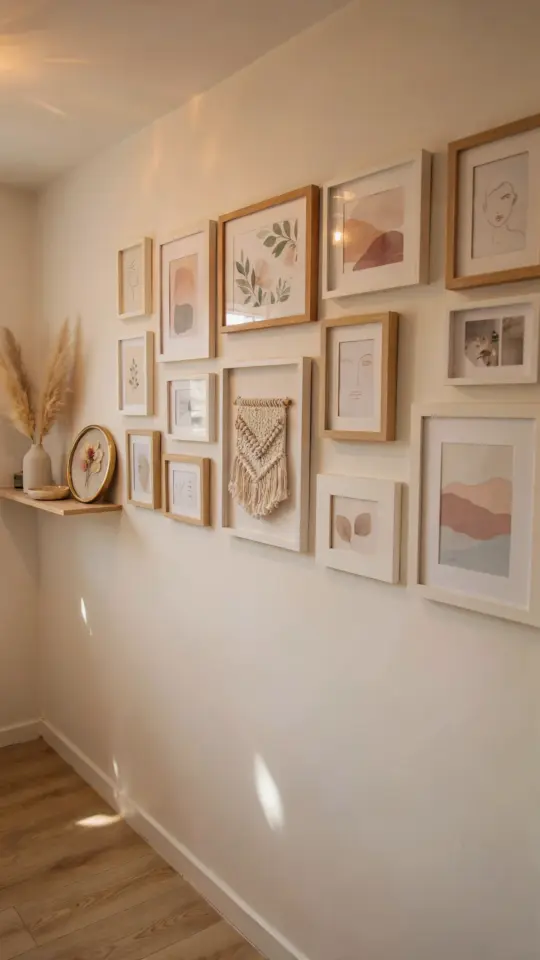
Why a Gallery Wall Feels Overwhelming (and What You Actually Need to Know)
If you have never hung a set of frames together, a DIY gallery wall layout can feel like a puzzle you are not sure you can solve. I remember staring at a blank wall in my first apartment, holding a hammer and wondering how to make five mismatched prints look intentional instead of accidental. The good news? You do not need an art degree or perfect eye for composition. You just need a simple system that accounts for one thing: spacing.
Small spaces, in particular, punish uneven gaps. A tiny living room or narrow hallway will look cluttered if your frames are too far apart or jammed together. This guide walks you through a beginner friendly process that removes the guesswork. We focus on GalleryWallDIY strategies that work even when your wall is only four feet wide.
Gallery Wall Spacing for Small Rooms: The Magic Number That Saves You
The most common mistake people make is guessing the gap between frames. You lean one picture slightly left, hang another slightly right, and suddenly the whole arrangement feels crooked. For small spaces, consistency is everything. The magic number for spacing between frames is 2 to 3 inches. That gap works on a 6 foot wall as well as on a 3 foot wall.
Two inches gives a tighter, more cohesive look. Three inches feels a bit more relaxed but still connected. I personally use 2.5 inches for most layouts. It is a happy medium that allows each piece to breathe without leaving too much empty wall. If you are working with very small frames (like 4×6 inches), drop to 1.5 inches. For large statement pieces, stretch to 3 inches. Write your chosen measurement down before you start hanging.
One more tip: keep the same gap horizontally and vertically. If you have a row of three frames, the space between each frame should match the space between rows. Uniform spacing makes the whole arrangement feel designed, not accidental.
How to Hang Art in a Small Apartment: The Floor Template Method
You do not actually need to start with nails. In fact, I recommend you never pick up a hammer until you have arranged everything on the floor first. This is the most practical DIYWallArt trick I have ever used. Clear a spot on your floor that is roughly the same size as your wall area. Lay out your frames face up and slide them around until you like the arrangement.
Once you have a layout that feels balanced, measure the distances between frames using a ruler. Write down the gaps. Then measure the entire outer dimensions of your frame group: height and width. This becomes your template. For a small apartment wall, keep the total width of the arrangement at about two thirds of the wall width. If your wall is 60 inches wide, your gallery wall should be around 40 inches wide. Leave breathing space on the sides.
Now here is the exact step that saves you from extra holes: lay the frames back on the floor exactly as you want them. Place a piece of kraft paper or wrapping paper on top and trace the outline of each frame. Mark the nail point for each piece (usually the top center of the hanger wire). Tape your paper template to the wall. Hammer nails directly through the paper. Rip the paper off and hang your frames. The spacing will be perfect.
Simple Gallery Wall Template for Tight Corners
If you are working with a corner wall or an awkward nook, a symmetrical template might not work. That is fine. For small spaces I actually prefer asymmetrical layouts because they feel more organic and less squeezed. A simple template for this is a loose L shape. Hang your largest frame at eye level near the corner, then build out to the right and down.
The key is to keep the same 2 to 3 inch spacing even with an asymmetrical shape. Use a level for each frame individually, but do not worry about aligning every top edge. Let the visual weight of each piece guide the placement. A good rule of thumb: place heavier or darker pieces lower and closer to the corner. Lighter, smaller pieces can float higher and toward the open wall.
One practical example from my own home: I had a 30 inch wide space between a window and a door. Too narrow for a traditional grid. I used a vertical column of three small frames, each spaced 2 inches apart, with the middle frame offset slightly to the right. It looked intentional and took up very little visual real estate.
Tips for Balanced Gallery Wall Design Without the Stress
Balance does not mean symmetry. Beginners often think every frame needs a mirror frame on the opposite side. That is one way to do it, but it is not the only way. For small spaces, balance is more about distributing visual weight. If you have a large dark print on the left, put a cluster of two or three lighter small frames on the right. The overall eye movement stays even.
Here are specific tips I use every time I create a WallDecorIdeas layout:
- Start with one anchor piece (your favorite or largest artwork) at eye level. Build everything else around it.
- Mix frame colors but keep the gap consistent. Black, white, and natural wood all work together if the spacing is uniform.
- Use a spirit level on every single frame. Even a half inch tilt will be noticeable in a small space.
- Do not fill the entire wall. Leave at least 4 inches of wall visible at the top and bottom edges of your arrangement.
Leave a Comment