Why Your Shiplap Photo Grid Looks Off Balance (And How to Fix It)
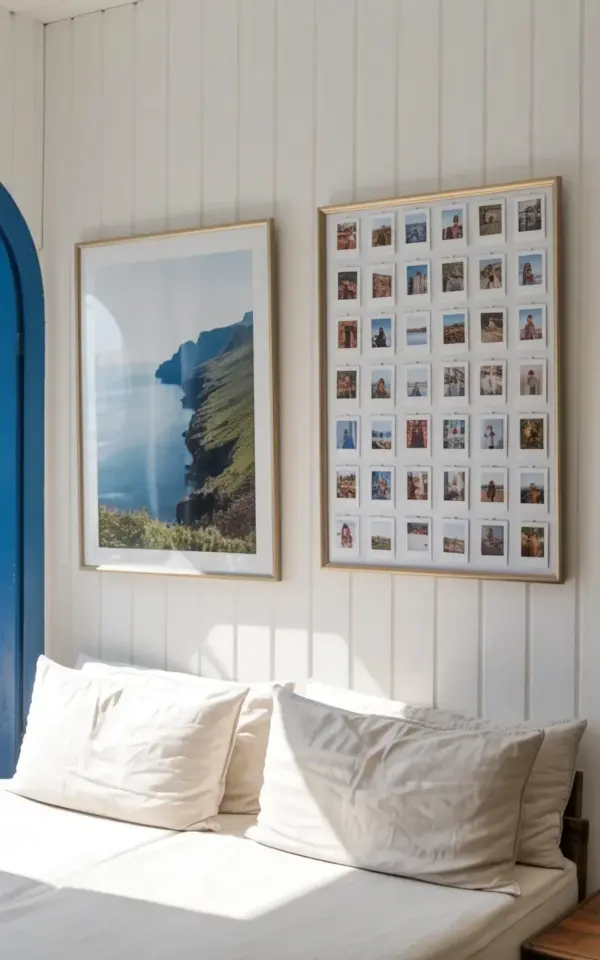
Look, I love a 30-photo grid on shiplap as much as the next person. It’s that perfect mix of clean and personal. But I’ve seen so many people try this and end up with a wall that feels lopsided or chaotic. The photo in this project shows exactly what works: a pre-made gold frame with 30 slots, mounted on crisp white vertical shiplap. To the left, a large landscape print in a matching gold frame. Below, a rumpled white daybed. A blue painted archway peeks in from the side. It’s minimal, it’s intentional. And it took me 15 minutes. Not gonna lie, the hardest part was picking which travel photos to include. Here’s the thing though: most people make mistakes before they even buy the frame. I want to help you skip those.
The Biggest Frame Mistake (It’s Not About the Color)
Ok so, you might think the gold frame is just a style choice. It is. But what matters more is that the frame holds exactly 30 photos in a clean 6 by 5 grid. No weird gaps, no mismatched sizes. I see people grab those collage frames with random slot shapes. Bad idea. They look messy and your photos fight each other. For a true shiplapgallery look, get a frame where every slot is exactly the same size. Mine has a thin gold border between each photo slot. That subtle structure keeps the wall from feeling like a scrapbook explosion. And here’s a weird personal thing: I almost bought a silver one because it was on sale. But gold against white shiplap? It warms the whole room. Don’t cheap out on the frame. It’s the anchor.
Mounting Without Measuring (Yes, Seriously)
I’ll be honest, I hate measuring. Levels, tape measures, pencil marks on fresh paint. It stresses me out. For this photogridwall, I didn’t measure a thing. The shiplap boards themselves become your guide. Each vertical board is exactly the same width, so I centered the frame visually between two boards. No math. Then I used two Command strips on the back top corners. Lightweight frame, solid hold. The landscape print on the left? Same trick. Just eyeballed the height so the bottom of both frames are level. It’s not perfect down to the millimeter, but in a room with a rumpled daybed and a blue archway, that slight imperfection feels human. You know what I mean? If you’re a perfectionist, sure, use a level. But for this project, close enough is genuinely better than overthinking.
Choosing the Companion Piece (Don’t Clutter the Wall)
In the photo, the left side has one large landscape print. That’s it. Two frames total. That’s the key to minimalistinterior success with a photo grid. A mistake I see constantly: people add a shelf, a clock, a plant, a quote sign, and suddenly the shiplap looks like a crowded flea market. No. Let the grid breathe. The landscape print acts as a visual counterweight. It’s calm, open, with blue water and green cliffs. It gives your eye a place to rest between the busy grid of 30 tiny memories. I picked a photo from the same trip as some of the grid pictures. That subtle connection makes the whole wall feel cohesive, not random. If you don’t have a landscape print, use a single large mirror in a similar gold frame. But keep it to two pieces. Three is pushing it. Four is a disaster.
The Daybed Puzzle (Why It Grounds Everything)
Honest opinion: without the white daybed beneath, this wall would float awkwardly. The rumpled white pillows and that soft linen texture tie the whole composition to the floor. I’ve seen people mount a di wall photogrid above a couch with crazy patterns or dark colors. It fights the photos. White shiplap needs white or off-white furniture below. It’s not a rule, it’s a visual weight thing. The daybed also makes the whole area feel like a cozy nook, not a museum display. So if you’re recreating this, think about what sits under the grid. A bench, a low console, even a stack of big floor cushions in white. Just keep it simple and light. The daybed in that photo has a slight rumple too. Not perfectly smoothed. That’s human. That’s the vibe.
Three Common Mini-Mistakes That Ruin the Look
Let me list the stuff I’ve done wrong myself so you don’t have to learn the hard way.
- Mixing photo orientations. All 30 of my photos are horizontal. If you throw in verticals, the grid pattern breaks. Just crop everything to the same orientation before printing.
- Overcrowding with color. Some of my travel photos have bright red markets or neon signs. I moved those to a different wall. For this grid, I chose photos with similar muted tones: greens, blues, whites, soft yellows. They blend, they don’t scream. You want a quiet story, not a circus.
- Ignoring the blue archway. In the background of the photo, there’s a painted blue arch. It adds a pop of color that contrasts with the white wall and gold frames. Without that arch, the room might feel sterile. If your space lacks a colored architectural feature, add one: paint a wall section, use a colored throw on the daybed, or introduce a small blue vase. That one accent makes the homedecorideas come alive.
Making It Personal (Without Losing the Minimalism)
I’ll tell you something silly. I spent two hours sorting through photos trying to find the “perfect” 30. Then I realized: the grid is supposed to be imperfect. It’s a snapshot of your life. Some of my 30 are blurry, some have people half looking away. That’s fine. A diyphoto wall like this shouldn’t look like a professional gallery. The charm is in the messiness. But minimalism means you still edit. So use a theme. Mine was “coastal trips and summer sunsets.” Every photo has either water or warm light. That subtle thread ties everything together. And honestly, seeing those 30 tiny moments every morning when I walk past? Way better than any store-bought art.
Conclusion
So there it is. A 30-photo grid on shiplap that took a quarter of an hour, no measuring, and zero stress. Avoid the common mistakes I shared: wrong frame, over-cluttered wall, mismatched photos, forgetting the furniture below. Keep it simple, keep it personal. Your wall will look like the one in the photo, but with your own stories. Now go grab a gold frame, pick 30 photos, and get that shiplap ready. You’ve got this. And if you pin it, tag me. I want to see your version.
#shiplapgallery #photogridwall #minimalistinterior #diyphoto #homedecorideas
Leave a Comment