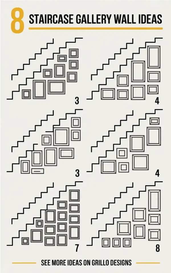
Ok so, full disclosure: I am the person who hung frames in a straight horizontal line up my staircase and then stood back and thought… why does this look so wrong? It took me way too long to realize the problem. The biggest mistake people make with a staircase gallery wall is hanging frames in a straight line instead of following the diagonal of your stairs. That’s right, the angle of your steps should guide the placement of your art. If you ignore it, you get that weird floating effect where the frames don’t relate to the stairs at all. Not gonna lie, mine looked like they were having their own little parade while the staircase did its own thing. Anyway, I learned my lesson, and now I’m sharing 8 layout ideas from that super helpful minimalist illustration (you know the one with the yellow “8” at the top and the Grillo Designs credit at the bottom). These layouts show exactly how to arrange frames at different heights and sizes to actually match your staircase angle. No more wonky spacing. Save this for when you’re planning your own wall.
The one mistake that throws off your whole staircase gallery wall
I remember visiting a friend’s house and she had this gorgeous collection of vintage botanical prints, all perfectly aligned in a row up her stairs. But every single frame was level and spaced evenly, and it felt… disconnected. Like the art existed in its own flat world, separate from the staircase that was literally carrying you up and down. That’s the issue.
Here’s the thing: your eye naturally follows the line of the stairs. If your frames are level, they break that flow. The trick is to tilt the whole arrangement along the same diagonal as your handrail or stair tread. Don’t worry, you don’t have to tilt each frame (please don’t, that’s a different disaster). Just the overall placement of the group should follow the stair angle. Simple, right?
If you’ve done this, you might notice:
- Your frames seem to float above the steps, like they’re hovering.
- The spacing between frames and stairs looks uneven from different angles.
- The whole wall feels static instead of dynamic, like a grid hanging on a slope.
Any of that sound familiar? Yeah, me too. I spent an entire afternoon rearranging frames because I used a level instead of following the stair slope. My husband still brings it up. (He thinks it’s funny. It’s not.)
What the 8 layouts in the illustration actually teach you
That clean black-and-white line drawing with the yellow “8” and the wave-like stairs on the left? It’s a goldmine. Each of those eight layouts shows a different way to arrange frames at staggered heights. Some use a single column of frames that step up with the stairs. Others spread out into a wider diagonal block. A couple of them mix in a large statement frame with smaller ones clustered around it. The key takeaway? No two layouts are exactly the same, but they all follow the same rule: the top of the frame group should be parallel to the stair slope.
Let me break down a few from the illustration:
- Layout 1: Three medium frames marching up the diagonal, each slightly higher than the last. Clean, geometric, almost like steps themselves.
- Layout 3: A large horizontal frame anchored near the bottom step, with two smaller vertical frames climbing above it like stairs themselves. The contrast in orientation keeps it lively.
- Layout 6: A cluster of six small frames in a loose diagonal block, perfect for a minimalist look. It’s almost a scatter, but the diagonal line holds it together.
Look at any of them and you’ll see the pattern: the bottom edge of the lowest frame aligns with the stair angle, and the top edge of the highest frame continues that line. Honestly, once you see it, you can’t unsee it. I keep that illustration saved on my phone for every new project.
How to match your frame height to your stair angle (no math degree required)
Ok so, you don’t need to break out a protractor. Here’s the hands-on method I use: stand at the bottom of your stairs and hold a ruler or a piece of string along the line of the stair tread or the handrail. Then, without moving your arm, look at where that line hits the wall. That’s your guide. Every frame you hang should have its bottom (or top) edge somewhere along that invisible line. Not exactly on it, but roughly parallel.
Another trick: tape sheets of paper to the wall in the layout you like. Use painter’s tape. Step back, look at it from different angles on the stairs. Move things around. You can do this over a weekend. It’s way better than drilling holes and regretting. I once did this with old wrapping paper cut into frame shapes. Took me three tries to get it right. But worth it. And honestly, it’s kind of fun to play gallery curator on your own staircase.
One more thing: if your staircase has a landing or a turn, treat each straight section as its own zone. The illustration mostly shows a single run, but you can adapt. Just keep the diagonal parallel to each section’s slope.
A practical guide to mixing frame sizes without overthinking
Here’s where a lot of people freeze. They worry about having too many small frames or one giant frame that throws off the balance. The illustration solves this by using varied rectangle dimensions. Notice how some layouts have tall skinny frames and others have wide ones. That’s intentional. The mix of orientations adds visual interest without looking chaotic.
One rule I swear by: don’t let any frame be too close in size to another. If you have three frames that are all 8×10, it starts to look like a grid. Instead, go for a 5×7, an 11×14, and a 16×20. The difference in scale makes the diagonal flow feel more natural. And for the
#staircasegallerywall #gallerywallideas #staircasedecor #homedecortips #wallartideas
Leave a Comment