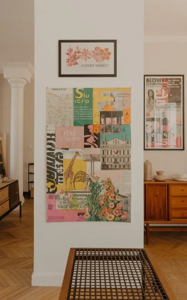
There is a spot on my living room wall that used to make me sigh every time I walked past it. Not anymore. I built this DIY wall art collage with vintage maps, a giraffe silhouette, floral clippings, and a framed FLOWER MARKET print, and it completely changed how that corner of the house feels. With a stack of old magazines and one patient afternoon, you can make your own. You do not need any art school training, just a pair of scissors and a willingness to move things around until they look right.
What You Need to Build Your First Wall Collage
Honestly, the supply list is almost insultingly simple. You need a flat workspace, scissors, a glue stick, and some magazines that you are ready to cut up. I used two old gardening magazines and one travel issue, but any mix works as long as it has floral patterns, maps, and text. I also printed a vintage map from a free public domain site because I wanted that faded, sepia-toned look without having to fake it by hand.
- Old magazines with flowers, architectural drawings, and small text snippets
- A printed vintage map or two, ideally with warm earth tones
- Sharp scissors and a glue stick (spray adhesive also works, but it makes a sticky mess on your fingers)
- One large sheet of sturdy paper or thin cardboard as the collage base
- A frame that fits the base, plus the FLOWER MARKET print to hang above it
You might be tempted to buy special collage paper. Do not bother. I used the back of a poster I had lying around, and it worked perfectly.
How to Choose a Color Palette for a Vintage Map Collage
Colors do the heavy lifting here. Before cutting anything, look at the map you picked and let it set the tone. Mine has pale yellow land, soft green borders, and those faint brown contour lines, so I pulled clippings that echoed those same colors. The floral pieces in the finished piece are pink, yellow, and deep green, which keeps everything connected even though the images are random. Earth tones anchor the whole thing, and the dark giraffe silhouette gives your eye a place to rest. If your map is blue, lean into blue, cream, and muted red instead. The palette matters much more than the individual images.
Adding a Giraffe Silhouette Without Drawing Skills
I cannot draw a giraffe to save my life. Instead, I found a side profile photo online, traced it onto plain paper, and cut it out as a template. That little paper shape became the center of the whole collage. You can use the exact same trick with any animal, a bird, a cat, a fox, whatever speaks to you. Just trace, cut, and lay it over a map or a busy magazine spread. The giraffe silhouette in my collage is dark brown, almost black, and it pops because the surrounding clippings are light and detailed. One more thing: a silhouette hides all the drawing mistakes. That is the real secret.
Working With Floral Clippings and Old Magazine Text
I cut around the flowers with no concern for neat edges. A little white border around a flower clipping actually looks deliberate, like a tiny framed piece. The collage also includes a small architectural drawing of a greenhouse from an old issue, and it became my favorite part. Text snippets are best when they are short. A single word or a short line looks intentional, but a whole paragraph starts to feel like a ransom note. I clipped the words “flower market” from a magazine title, which later inspired the framed print I hung above the main piece.
How to Arrange a Mixed Media Collage on Paper
Do not glue anything until you have laid everything out and walked away for a few minutes. Seriously. I arranged the map pieces first, then placed the giraffe silhouette slightly off center, and then tucked flowers and text around the edges. Overlapping the corners helps everything feel layered rather than stuck on. In the photo, the giraffe sits right on top of a map section, with floral clippings filling the empty spaces. Architectural drawings can go behind or beside the text, whichever balances the weight. Take a photo with your phone, look at it, and move things around again. That tiny step solves most composition problems before they become permanent.
Framing Your Collage and Adding a FLOWER MARKET Print
The framed FLOWER MARKET print above the collage is what makes the whole wall feel curated. It has pink and orange floral designs that pull the colors out of the collage below. I used a simple black frame with a wide white mat for the collage, and the print hangs about three inches above it. If you have high ceilings, you can leave more space, but keep them close enough that they read as one display. You do not need a fancy custom frame. Thrift stores and big box stores sell perfectly good frames, and the mat does most of the design work for you.
Making It Feel Like Yours
No one else will ever have this exact wall art, which is the entire point. The magazine will be different, the map will be different, and you will probably cut your giraffe silhouette in a way that is slightly tilted. That is fine. Actually, it is better. The imperfections make it look like a human made it, because a human did. I have a pair of comically oversized hotel gift shop scissors that I refuse to replace, and somehow they still cut straight enough. Use what you have. Make the first cut, lay out the pieces, and glue them down before you talk yourself out of it. I would love to hear how your version turns out.
Leave a Comment