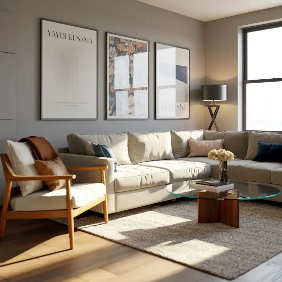
For years, my living room walls had the personality of a rental agreement: completely blank and slightly apologetic. So when I stumbled across the recent makeover of a costume designer’s childhood apartment, I was less interested in the new sofa and more obsessed with the walls.
The designer, who grew up in this flat, gave it a warm contemporary refresh that feels lived-in, not staged. Honestly, the framed print wall decor is the standout feature. He didn’t just hang a few posters; he built a narrative using vintage frames and modern art, and it completely transformed the space.
If you have a pile of art prints gathering dust in a drawer, this approach is for you. Here is the practical, step-by-step process I took away from his redesign, which you can absolutely steal for your own DIY wall art arrangement.
Collecting the Raw Material: Frames Before Prints
The first lesson from his flat is that the frame matters as much as the picture. He didn’t buy a matching set from a big-box store. Instead, he mixed heavy, ornate vintage frames with sleek, minimalist modern ones. The contrast creates the visual interest.
Start by raiding thrift stores, flea markets, and your grandmother’s attic. Look for:
– Solid wood frames with a patina that can’t be faked
– Brass or gold-toned frames (even if the finish is worn)
– Unusual shapes like ovals or octagons
– Big, clunky frames that are too ugly to hang alone but perfect with art inside
– Cheap IKEA frames you already own that can be spray-painted
You are looking for variety. If all your frames are the same width, the wall will look too neat, almost like a furniture showroom. You want the collection to feel like it was gathered over time, because that is the core of warm contemporary style. It needs to feel collected, not purchased in one afternoon, more like a wardrobe you’ve built over years than a single shopping trip.
Sorting and Organizing: The Color and Texture Edit
Once you have your frame stash, lay everything out on the floor. Before you commit to putting holes in the wall, you have to edit the chaos.
Group the frames by dominant color and finish. In the designer’s flat, he stuck mostly to dark woods, black, and a few gilt frames. That consistency is what prevents the arrangement from looking like a chaotic college dorm wall. He also mixed in one or two raw wood frames to add texture and a bit of that handmade, DIY feel.
This is the moment where you decide which frames actually make the cut. If a frame is too shiny, tone it down with a light sanding. If one is too precious, maybe it belongs on a shelf instead. You are curating a gallery, not a flea market stall, so be picky about the weight and tone of each piece.
Selecting the Art: Where Vintage Meets Modern
Here is where the costume designer part of his brain kicked in. He treated the art like a character study. He paired delicate botanical sketches next to bold, abstract graphics. There was a vintage portrait of a dog (which I genuinely laughed at) hanging right beside a stark black-and-white photograph of an old theater.
The trick is to let the frames unify the art. If you have a wild, colorful modern print, put it in a heavy, dark vintage frame to ground it. If you have a faded antique map, give it a clean white or black modern frame to sharpen it up. You are creating a dialogue between the old and the new, and that tension is what makes the wall feel alive.
You don’t need expensive original artwork either. I saw a botanical print from a 1970s encyclopedia and a concert poster from his youth on the same wall. The mix of high and low, serious and playful, is the entire point.
Mapping the Wall: The Newspaper and Tape Method
Do not, and I repeat, do not start hammering nails into the wall immediately. The designer’s secret was laying the entire configuration out on the floor first. But more importantly, he used the easiest trick in the book to visualize it on the wall: craft paper.
Measure the full footprint of your layout. Then, cut out sheets of wrapping paper or newspaper to the exact size of each frame. Tape these paper templates to the wall in your desired arrangement. This allows you to walk away, look at it from the sofa, and adjust the spacing without committing.
You can rearrange the paper rectangles a dozen times without damaging the paint. Once you are happy with the balance, you know exactly where each nail goes. It takes an extra thirty minutes, but it saves you from having a wall full of holes in the wrong places and a crooked mess.
Hanging and Spacing: The Technical Details
Ok so here is the part everyone gets wrong. People tend to hang art too high and too far apart. In this flat, the frames were clustered tightly, with a gap of about two to three inches between frames. This proximity creates that cozy, collected look. It reads as a single unit of art rather than individual floating objects.
When you are dealing with a gallery wall, consider these practical tips:
– Start with the largest piece as your anchor and build outward
– Keep the outer edges of the entire layout visually aligned, either on a straight vertical or horizontal line
– Use picture-hanging strips for the lighter prints to avoid making a mess
– For the heavy, giant frames, use proper wall anchors so they don’t come crashing down at 3 a.m.
Another thing I noticed was the placement of the wall art in relation to the furniture. The main collage was hung lower than you might expect, so it was eye-level when seated on the sofa. It felt intimate, and it made the room feel bigger, drawing your eye across the wall rather than up toward the ceiling.
Balancing the Layout with Furniture and Lighting
The framed walls only worked because he balanced them with the rest of the room. He paired the busy wall with low-profile, modern furniture in warm neutral tones like oatmeal linen and soft tan leather. The walls did all the talking, so the furniture remained quiet.
Also, check the lighting. He installed a couple of simple, adjustable picture lights above the main gallery. It sounds like a small thing, but the warm glow turned the framed print wall decor into a focal point that shifts as you walk through the room. If you don’t want to wire lights, a simple floor lamp aimed at the wall will do the same job and create that cozy, evening atmosphere.
Don’t be afraid to lean a large frame on the floor or on a mantle instead of hanging it. This breaks up the “perfection” of the wall and adds a very trendy, yet practical, layer to the design. It also hides the fact that you ran out of wall space.
Embracing Imperfection and Personal History
The most refreshing thing about this makeover was the lack of perfection. One of the frames was slightly bent in the corner. A small print had a crease in it that wasn’t ironed out. He kept them. Honestly, those flaws are what make the space feel human and lived-in, and they are the exact opposite of a sterile hotel lobby.
He didn’t hang magazine-perfect prints. He hung things he actually loved: a ticket stub from a show, a hand-drawn sketch by a friend, a postcard from a trip to Morocco. This is where you get to be vulnerable and specific. Your wall should tell your story, not the story of a furniture catalog.
So, as you start your own project, don’t overthink the pairings. Just start. Collect the frames you like, pick the prints that make you happy, and play around on the floor until something clicks. You will be surprised by how quickly a collection of random objects can transform into an intentional, beautiful narrative that makes your space feel like a home. Go raid that thrift store, and then send me a photo of what you build, I genuinely want to see it.
Leave a Comment