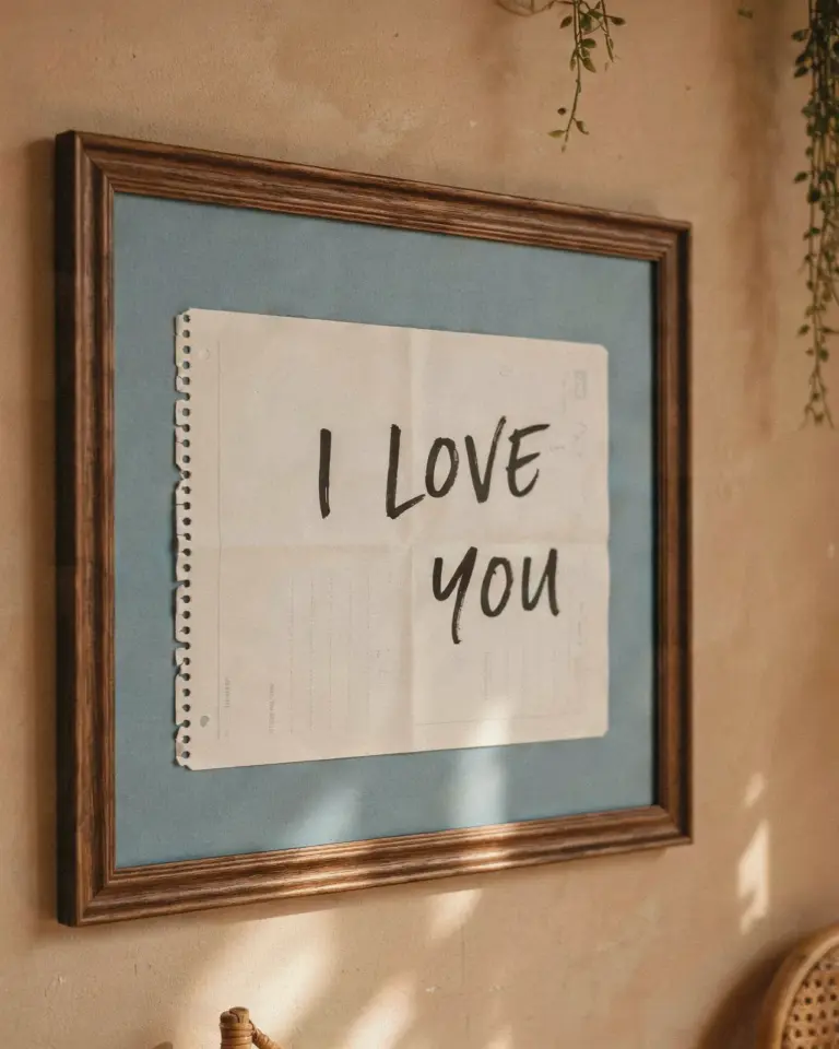
I had been staring at our long, empty living room wall for months, mentally rearranging furniture that wasn’t there to distract myself from the sheer beige nothingness. Every time I walked past it, I felt a little twitch of annoyance. So, one weekend, I finally snapped and decided to build a framed print gallery wall using nothing but frame sets, my inkjet printer, and a stubborn refusal to pay gallery prices. Honestly, the whole project took one lazy Saturday afternoon, and the transformation has completely shocked me every single day since.
Budget friendly gallery wall ideas that actually look expensive
Let’s talk money, because that is the real magic trick here. I knew I wanted a big, impactful display, but I did not want to spend two hundred dollars on frames alone. The solution I landed on was buying matching frame sets, which come in those neat, slightly intimidating black cardboard boxes. You can snag a set of five or six frames for the price of maybe one and a half fancy frames from a department store, and they usually come with a pre-cut mat board included.
I went with a matte black finish for the frames, which is the equivalent of a classic little black dress for your walls. It goes with absolutely everything and gives the art a crisp, clean edge. Here’s the thing though, you don’t need to tell anyone they’re from a budget store. The uniformity of the frames does all the heavy lifting, making the whole arrangement look curated and intentional rather than cheap.
For the “art” itself, I raided the internet for free vintage botanical illustrations and high-resolution public domain images. We’re talking old mushroom diagrams, oddly specific anatomy sketches, and some moody landscape paintings. Printing them on standard matte photo paper looks just as good as a store-bought print, and if I accidentally mess up the sizing, I just hit print again. The savings feel illegal, and every time I look at the wall, I get a little rush from knowing I did it for pennies on the dollar.
Easy DIY wall art ideas for people who lack patience
Ok so, let’s be real for a second. I am not a crafty person who enjoys intricate projects that require a lot of steady hands. My patience for detail work runs out around the ten-minute mark. That’s why this concept works so well for me. It’s less about “creating” art and more about cleverly “curating” images that already exist. My only real job was to measure a layout, which is genuinely the hardest part.
I actually avoided the classic “paper on the wall with painter’s tape” trick and just went for it, which I do NOT recommend. I definitely have a few extra nail holes above the frames that tell the story of my hubris. A better, slightly more methodical approach is to lay the frames out on the floor first, arrange and rearrange them until you like the vibe, and then measure the distance between them. I used a two-inch gap between each frame, and while a measuring tape is great, a piece of cardboard cut to that width is way faster to move around.
- Use the floor to test layouts, no need to hold things up and guess.
- Frames in a set are usually identical, so you can move them around freely without worrying about dimensions.
- Forget the hammer; use command strips if you have lighter frames, it’s less commitment.
- Do a quick test print on regular copy paper first to check the color contrast.
The actual time spent hammering nails was maybe fifteen minutes. The rest of the time was just me sitting on the couch squinting at the assortment on the floor, which felt more like procrastination than interior design, but it worked.
The maximalist approach to a framed print gallery wall
I know a lot of gallery walls stick to a strict grid, which is clean and safe, but my wall needed a bit of chaos. I leaned into a maximalist approach where I mixed different image styles but kept the frames identical to preserve some sanity. That’s the secret ingredient for a busy wall that doesn’t look like a chaotic mess, and it’s honestly a foolproof formula. You get the “collected over time” look without actually having to roam antique shops and haggle with strangers.
I threw in a portrait of a Victorian woman with a severe haircut right next to a bright red poppy illustration. It makes zero sense conceptually, but visually it just works. The tension between the subjects keeps your eye moving around the space. If you are worried about it looking too cluttered, just keep the background wall color neutral. Our wall is a warm off-white, so it can handle the visual noise without feeling overwhelming.
This style is forgiving, too. Because there is so much going on, nobody is going to notice if one picture is half a centimeter out of alignment. As long as you are consistent with the gap between frames, the overall flow will look intentional. It’s like adding spices to a soup; you want a bit of variety, but you still want to recognize it as soup at the end of the day.
Color coordinated gallery wall ideas for a calm space
If the chaotic maximalist thing feels stressful to you, there is also a distinct theme that centers on a muted palette. I almost went this route instead, using only images with faded, earthy tones. Think sepia photographs, beige and sage green abstract shapes, and line drawings in charcoal gray. It gives the room a much more serene, spa-like atmosphere, which is great for a bedroom or a reading nook.
With this approach, you pull art that is similar in color but opposite in shape and size. So maybe you have a big, barely-there watercolor wash next to a tiny, highly detailed insect sketch. The common denominator is the color palette, not the subject. This is also a safe space to include a framed fabric scrap or a piece of vintage sheet music, anything that fits the color story works.
I found this works best with wooden frames instead of black. A light oak or walnut frame adds another layer of warmth that reinforces the earthy vibe. It’s the kind of wall you can stare at while drinking tea and feel your blood pressure lower, which frankly, is a scientific fact I made up just now, but it feels true.
The rules (and non rules) of hanging a large frame set
There is a common interior design rule that says the center of your art should sit at eye level, which usually translates to about 57 or 60 inches from the floor. But let me tell you, rules are made to be broken when you have furniture in the way. Since we have a low-slung console table below the wall, I hung the gallery slightly higher, treating the table and the pictures as one cohesive unit rather than separate zones.
My biggest tip is to work from the center out. Pick the piece you love the most, hang it first, and build outwards from there. This ensures that the most interesting part of the collage is actually in the visual center, rather than being off to the side and making the whole wall feel unbalanced. It also means you don’t have to measure the entire width of the space perfectly; you just measure from your center point.
And do not stress about getting the frames completely level. Obviously, use a bubble level, but if you are off by a tiny fraction, nobody will notice. As a professional perfectionist, I had to actively stop myself from obsessing over a level that kept telling me I was a failure. Once I stepped back and looked at the wall as a whole, I realized the tiny imperfections just make it look handmade and charming.
Quick and easy upgrades to make cheap frames look premium
Here is a weird little tangent for you: those cheap frames often come with a plastic “glass” that looks a bit flimsy and reflects light terribly. I noticed it immediately when the sun hit the wall at noon and made two of my prints look completely washed out. The fix was surprisingly simple, I just removed the plastic for a few of them. Without the plastic reflection, the matte paper print looks like it could be a genuine poster from a museum gift shop, not a cheapie from a big box store.
Also, ditch the picture that ships inside the frame. You know the one, that weird generic landscape with the sunset. Use the mat, but toss the pre-printed filler paper to the side, you don’t need it. That pre-cut mat board is the real MVP. It gives your eye a blank space to rest before focusing on the art, and it instantly makes a cheap frame look like a custom-fitted archival setup.
If you want to be extra fancy, you can back your prints with black cardstock before placing them in the frame. This adds a nice shadow effect against the mat, and it masks any rough edges where your print might be a bit wonky. It’s a one-minute step that adds a whole dimension of depth, I’m not going to lie, it looks classy as hell.
By the end of the afternoon, the wall had gone from a featureless void to my favorite spot in the apartment. It is honestly the first thing I notice when I walk into the room, and it makes me irrationally happy. The total cost was around forty bucks, and people genuinely assume I hired someone to do it or spent a fortune on the artwork.
If you have a blank wall that you keep ignoring, this is your sign to just do it. Print some art, buy a frame set, and see what happens. You can easily transform your space this weekend, and if you want to remember the exact process, just save this post for later. We all need a little reminder that we can change our environment without waiting for a magical budget or a fully furnished house. Go make your wall say something about you.
Leave a Comment