Why a Lighthouse Painting with a Postage Stamp Frame Feels Like Summer
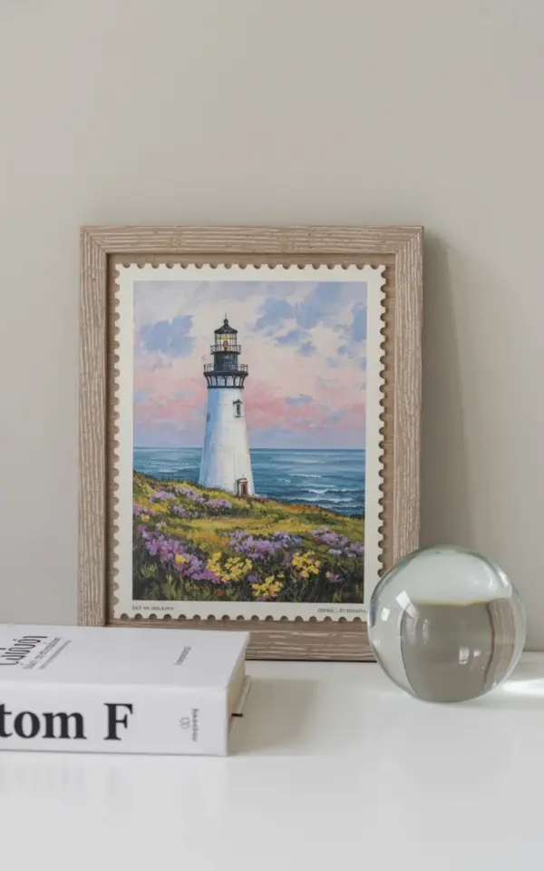
I have a small confession. Every time I see a lighthouse painting with that scalloped postage stamp border, my brain immediately plays the sound of waves. It’s not just the subject matter. It’s the way the frame itself becomes part of the story, like a handwritten letter mailed from a coastal town. This particular piece shows a white lighthouse with a black top standing against a pink and blue sky. The grassy hillside in front is dotted with purple and yellow wildflowers, and beyond that, the ocean stretches in layered shades of blue. The light wooden frame has a scalloped edge that mimics perforated stamps, and the whole thing sits on a white surface against a white wall. It’s cheerful without being loud, nautical without being cliché.
If you are decorating a beach house for summer, this kind of print does something special. It anchors a room in a specific time of day, the golden hour when the sky turns pastel and the flowers catch the last light. And the postage stamp frame adds a collected, travel-inspired feel. You can almost imagine licking the back and sticking it to a postcard.
Below I have pulled together five distinct ways to use this artwork in your home or as a gift. Each section focuses on a different theme, so you can pick the direction that fits your style best.
Summer Decor: Pairing the Art with Light and Texture
The first thing I noticed about this print is how much it loves natural light. When hung on a white wall, the pink and blue sky seems to glow, especially during afternoon sun. For a beach house, I recommend keeping the surrounding decor light and textured. Think linen curtains, a jute rug, and maybe a whitewashed console table underneath.
One practical tip: place the artwork where it can catch indirect light from a window. If you set it on a white surface like a shelf or sideboard, the reflection softens the edges of the frame. The scalloped border becomes more pronounced when the light hits it from an angle.
Here are a few other textures that complement the nautical theme without competing with the print:
- Natural wood – driftwood accents or light oak furniture echo the frame’s wood tone.
- Soft blues and creams – throw pillows or ceramics in those same ocean shades.
- Woven baskets – a small basket holding seashells or a rolled towel adds a beachy, uncluttered look.
Coastal Wall Art: Arranging a Gallery Around the Lighthouse
If you want to build a gallery wall, this print makes an excellent anchor piece. Because the postage stamp frame already feels like its own tiny world, you can surround it with smaller items that tell a broader coastal story. I have seen people pair it with a vintage map of the coastline, a pressed seaweed frame, and a simple line drawing of a gull.
The key (and I use that word loosely) is to keep the frames varied but in the same tonal family. White, light wood, or thin black frames work well together. The scalloped border of the lighthouse print stands out because the other frames are straight-edged. That contrast draws the eye right to the center.
Another idea: hang it right above a small shelf that holds a stack of beach reads and a tiny potted succulent. The wildflowers in the painting will echo the green of the plant, and the blue sky will match the book covers if you pick ones with ocean themes.
Nautical Print Gift Ideas for Hosts and Housewarmings
This is the kind of gift you can give without worrying about taste. The colors are universal enough (pink, blue, soft green, wood tone) that it blends into most beach house, cottage, or even city apartment decor. I have given a similar print to a friend who just moved into a lakeside cabin, and framed it works just as well there. The lighthouse reads as a symbol of safety and homecoming rather than strictly nautical.
For a housewarming gift, consider pairing the print with a small matching item: a scalloped ceramic dish, a set of notecards with a lighthouse motif, or a bag of locally roasted coffee from a coastal roaster. That way the recipient gets both the visual anchor and a little taste of summer.
If you are mailing the gift (which feels appropriate given the postage stamp theme), make sure the frame is well padded. The scalloped edges can be a bit fragile if the corner takes a hit. I usually bubble wrap the entire front and then add a layer of cardboard.
Wildflower and Sky Pairings: Styling with Natural Elements
Because the painting includes purple and yellow wildflowers, you can pull those colors into the room in subtle ways. A small vase of dried lavender or yellow strawflowers on a nearby table directly echoes the foreground. I have also seen people place a single seashell with a purple inner lip next to the frame, which ties the ocean and the flowers together without being literal.
The pink and blue sky is trickier to match, but you can choose an accent pillow or a throw blanket that has a similar pastel gradient. Just be careful not to overdo it. Let the artwork be the main source of color, and keep everything else neutral or muted. A white wall and a light surface, like the photo shows, are already the perfect stage.
If you feel adventurous, you could even paint a small section of the wall behind the print a pale blush or sky blue. But I prefer the crisp white look because it makes the scalloped frame pop like a real stamp on an envelope.
Summer Wall Decor Inspiration: Rotating Art Seasonally
One of the best things about a piece like this is that it can live out of the closet for only three months and feel fresh every year. I swap my wall art with the seasons, and this lighthouse print is my go to for June through August. When autumn comes, I switch to something with warm oranges and browns. But the lighthouse stays in my memory.
If you are someone who likes to rotate decor, consider using a hook system so you can swap prints without damaging the wall. Or just lean the framed piece on a shelf against the wall. That casual leaning look works perfectly for a beach house anyway. It feels spontaneous and relaxed.
For summer specifically, this print pairs well with other items that have a light, airy vibe. A small mirror with a rope border, a stack of white towels, a ceramic starfish paperweight. Nothing too heavy. The whole point is to let the room breathe.
And if you ever want to add a second lighthouse print to the same room, choose one with a different color palette. A black and white lighthouse photograph would contrast nicely with this pink and blue one. But keep the frames similar in scale and tone to maintain cohesion.
Wrapping Up with a Soft Call to Action
I hope these ideas give you a clearer picture of how a postage stamp frame lighthouse art print can turn a simple wall into a summer memory. Whether you hang it alone, build a gallery around it, or gift it to a loved one, the white lighthouse against a pink and blue sky carries that coastal charm all season long.
If you already own a similar print or have a favorite spot where summer art lives in your home, I would love to hear about it. Drop a comment below or tag me in a picture. Happy decorating.
#lighthousepainting #postagestampframe #coastalwallart #summerdecor #nauticalprint
Leave a Comment