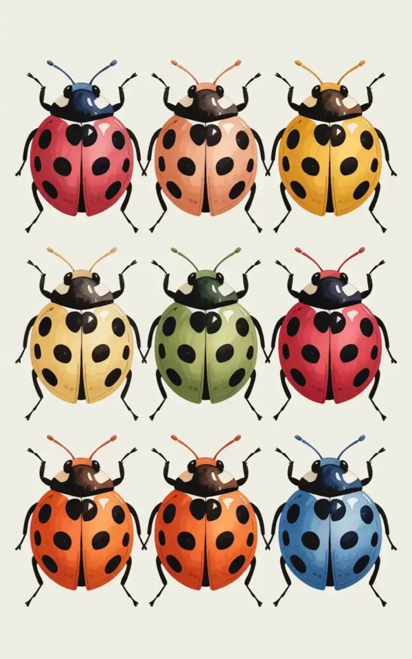
Nine ladybugs, each one a different shade, sit in a neat 3×3 grid on cream colored paper. This watercolor ladybug art print has a handmade feel that a basic poster just can’t fake. The top row gives you red, coral, and yellow. The middle row plays with pale yellow, green, and deep red. The bottom row throws in orange, coral, and a blue one nobody expects.
For anyone hunting for unique insect wall art, this is the kind of piece that stops people mid-step. It’s not one bug floating lost in white space. It’s a collection, almost like a tiny scientific study that happens to be adorable. And it works in a nursery, a reading nook, or even a hallway corner that needs a little color. The hand-painted spots and delicate antennae make each ladybug feel like its own small character.
Name the wall before you buy the frame
The first step is to decide where this print will live. Grab a tape measure and actually mark the space on the wall with painter’s tape. I once hung a small frame too high above a dresser and had to move it three times. My arm still remembers.
Because the ladybugs form a tidy 3×3 grid, the print looks best in a spot where you can see the whole layout at once. A narrow vertical gap between shelves can feel crowded. A wider open wall gives the nine bugs room to breathe. If you’re planning to hang it over a crib or a chair, keep the center of the print around chest height for an adult, or slightly lower if it’s strictly for a child to look at.
Choosing a frame that won’t fight the watercolor
A thin black frame is a safe choice. So is a natural wood frame with a simple profile. The illustration itself has soft watercolor edges, so a heavy ornate frame will compete with the delicate antennae and six thin black legs on each bug.
A white or cream mat can do a lot of good here. It echoes the cream background and gives the nine ladybugs a little buffer from the room around them. If you go matless, choose a frame that’s close in tone to the background. The goal is to let the red, coral, yellow, green, and blue bodies stand out without the frame yelling for attention.
Where to hang insect wall art so it actually gets noticed
In a nursery, hang it near the changing table or beside the rocker. Those are the spots where you’re already standing for long stretches, and you’ll appreciate the company. In a reading nook, place it at eye level above a low shelf or a small armchair.
I have a strange habit of hanging art in unexpected places. One of my favorite prints ever ended up next to my coffee station, and honestly, it made mornings better. This ladybug print would do the same thing above a sideboard, a desk, or a stack of books.
Keep it out of direct sunlight, though. Watercolor illustrations on paper can fade over time, and the blue ladybug in the bottom row is too good to lose.
Pairing this ladybug art with nursery decor without making it babyish
You don’t need a ladybug-themed room to hang this. In fact, the print looks stronger when the room around it stays calm. Try a soft cream, pale sage, or warm beige wall behind it. The muted colors let the nine bright ladybugs carry the color load.
If you want to pull colors from the print, use the yellow or green in a blanket, a rug, or a simple cushion. The coral and deep red can show up in small accents. But here’s the thing: don’t add more ladybug stuff. One piece of ladybug art is enough. Too many matching bug accessories turn the whole space into a theme park, and this print deserves better.
What to look for in a watercolor illustration print
When you’re checking any watercolor illustration online, zoom in on the details. The legs matter. In this piece, each bug has six legs drawn in thin black lines, plus a black rounded head and delicate antennae. If those lines look blurry or pixelated at full size, the print quality probably won’t improve once it’s on paper.
Look at the spots too. They should sit naturally on each rounded back, with soft watercolor edges rather than muddy patches. The red, coral, yellow, pale yellow, green, deep red, orange, and blue should all feel clean, not washed out. And the cream background should look like actual paper, not a grayish off-white that suggests cheap printing.
Quick checklist before you add to cart
- Frame size: measure your wall space first, and remember that a mat adds a few extra inches to the overall frame.
- Paper quality: look for thick, archival paper that won’t buckle or yellow quickly.
Leave a Comment